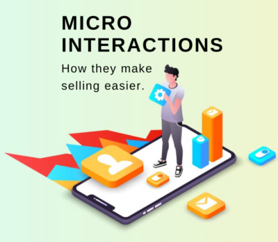
In most customer journeys, there are normally several small interactions people have with a business that leads to them finally converting. I call these micro interactions and if you can get these right, it makes asking for the final sale much easier.
When a customer lands on your website or walks into your shop, they are interested in what you do but may need a minute to confirm to themselves you are the company they want to purchase from.
Have you ever been into a clothes shop where they start with, “what are you looking for today? Our sale items are on the front table…”. It feels like the only two options I have are to buy or leave the shop. A better way to welcome customers is to say something along the lines of “hey, how are you going?”. Then after rapport has been built, suggest they can touch and feel any of the clothes and try them on if they would like. Now because the lines of communication have been opened with the shop assistant, I’m more likely to spend more time in the shop and ask questions about the clothes. And 5 minutes later I’m leaving the shop with a new t-shirt (or four).
It’s the same online; giving customers an option to interact with your website in a low-sales-pressure way can help break the ice. In this article, we’ll go through a few of these micro interactions you can add or optimise in your customer journey that can increase the likelihood a customer will convert.
Why Micro Interactions Are Beneficial For Your Business
The Consistency Principle
In Robert Cialdini’s famous book ‘Influence: Science and Practice’ he shares 7 ways to influence people. In one of his experiments, he found that asking people to display a postcard in their front window to promote safe driving increased the likelihood someone would be willing to display an ugly billboard saying the same thing in their front garden by 400% vs people who had not been asked to display a postcard first.
The increase came because the researcher had got their foot in the door with a small request, which broke the ice with the tenant. But then, when the bigger request came, people wanted to be consistent with the things they had previously said (or done) before.
There are a number of factors to consider in conversion optimisation, including your website copy, design, imagery and much more. However, if you can make it easy for people to start interacting with you in any way, the likelihood they will convert goes up for each action they take. And if you can really play on the consistency principle as you build your micro interactions, you can turbocharge the results.
Micro Interactions Force You To See Your Marketing From A New Perspective
It is tempting in any conversion optimisation effort to try and let customers convert in as few clicks as possible and remove every other distraction. While this is a good mindset to have and one I still keep front of mind, the interactions that lead to a conversion are more complicated than just clicking the buy now or sign-up button.
Instead, we can look at the customer journey as “what is the path of least resistance” and where is the “next click of least resistance”? By doing this, it forces us to see our marketing as the customer does and work from the first interaction forward rather than just the result back.
10 Micro Interactions That Lead To Increased Customer Conversions
Some micro interactions fall into standard conversion optimisation techniques. However, if you view them from the point of view of each interaction building consistency in someone’s desires, you can turbocharge your conversion optimisation efforts.
1. Optimising Product Filters
For any eCom store with multiple products, optimising the category page product filters can dramatically increase conversions. This is especially true when people don’t know the exact product they are after, e.g., they just want a ‘Bluetooth Headset’ but don’t know the exact model & features they are after yet.
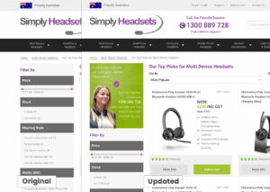
When working with Simply Headsets, we found that anyone that interacted with the product filter was 4x more likely to convert than those that didn’t. So, we asked how we could make using it more appealing so more visitors clicked it and started their journey to committing to buying a product. We decided one quick way to bring more attention to it was by adding an eye-catching image above the filter.
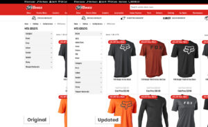 Idea: As a mountain biker, I use 99 Bikes website a lot. However, they could optimise their category page filters. Right now, when you go to their website, all of their possible filter options tabs are closed; however, my guess would be if they displayed the first tab as open and put their most popular filter items first, more people would use them, potentially meaning more people would convert if the above stats from my tests cross over to their website.
2. Customer Focused Navigation
When looking at a website’s navigation, I ask if the terms that are being used make sense to the customer and can I reduce the number of clicks needed to find the key pages.
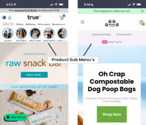
For example, many eCom sites now include a sub-navigation showing their product categories. This allows visitors to quickly find the key product categories without having to click through an overwhelming mega menu.
3. Product Finder / Recommendation Wizard
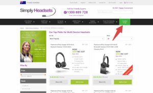
If you have multiple products or services, a product finer quiz can help customers find what they are after based on their specific needs instead of having to scroll through all the products to find one they like.
When I worked with Simply Headsets, we found that people who went through the product finder wizard were 3x more likely to convert. To draw attention to the fact this option was available and increase the number of people who used it, we simply highlighted it, making it a button in the main menu.
But it’s not just product businesses that can take advantage of quizzes and wizards. Service companies can also create highly effective service finder quizzes. An example of this is Mortgage Choice which created a finder to help first-time buyers understand if they qualify for first-home buyer grants.
To really boost the effectiveness of this micro interaction and play on the consistency principle, I suggest including a sentence that summarises what the customer has input into the product finder on the results page. An example of this could be, “Based on the fact you said you wanted a dress for a casual event that is outside, and you like pastel colours, we suggest X dress below”. You could take the product finder wizard experience one step further and add a personalised follow-up video at the end of it. Check out BHuman’s fashion example.
4. Second Image On Rollover
Adding a secondary image when you roll your mouse over an image on the page can not only add some movement to your website. But help provide some more context to the product or service the image represents, enticing the potential customer to click through.
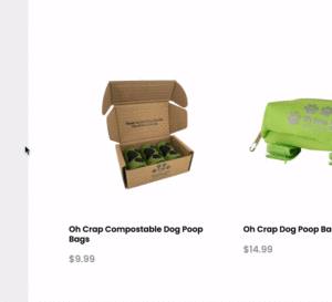
On the Oh Crap website, I’ve added user-generated content as it’s currently a pattern interrupt vs the majority of eCom sites around right now. Or another idea is to add an image that opens a story loop in the potential customers’ minds (the Zeigarnik Effect), meaning customers have to click on the product page to close the loop.
5. Watch Video
We have all heard by now that video sells. They do because customers love them, and they are a lot more exciting to click on than pretty much any other element you could put on your website.
Here is a guide on the different types of videos you can make for your website.
If you’d like the other five ways (and they’re rippers) that micro interactions can make your selling process easier, then join me and loads of other motivated business owners inside my Small Business Owning Membership which starts from $8.50/month.
Conclusion
In this article, we’ve gone through 10 (well 5 for now!) ways to add micro interactions to your website or marketing campaigns. None of these has a specific sales-related call to action but is instead are a great way for potential customers to get to know you. As customers take each action, they are slowly building a case in their minds why they should buy from you.
Most modern websites have many of the micro interactions mentioned above. But I encourage you to start tracking them in analytics and seeing which actions lead to increases in conversions. Then when you have the data, you can start optimising each element to get the maximum effect out of it.
This is just a short list of the main micro interactions, but I’d like to hear how you use micro interactions in your business in the comments below.