This guest post was kindly written and provided by Nick Humphries of Startup Video. Thanks Nick!
When it comes to Landing Pages, be a Virgin
It absolutely shocks me that companies are still using paragraphs of unappealing text to explain what they do on their home pages. It seems that marketers still don’t know how long users stay on web pages and that they only have a few seconds to convince their potential customer to look around more. Otherwise their business goes elsewhere.
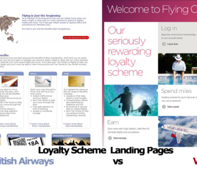
Screenshot of BA and Virgin’s Landing Pages (September, 2013)
Take a look at this side by side comparison of loyalty program landing pages for these two airline heavyweights. British looks like they haven’t updated their page since 2005. Virgin has decided to go for a Windows 8 sort of design. Clean, simplistic and straight to the point with a clear call-to-action. I think you can see pretty clearly here who’s going to get more new, loyal customers for the coming years.
For landing pages that convert, this is a clear ‘call to action’
Let’s face it. The truth is, everyone has internet ADD these days. As I’m writing this article with 12 tabs open in Firefox, a Spotify playlist now needs my immediate attention to skip the current song. I don’t know how this Miley Cyrus song started playing. Earlier, I received a DM from a work colleague via Twitter who told me to go checkout a link on YouTube. After 20 seconds, I realized this video wasn’t worth watching. So I did something more worthwhile. I saw a headline in the recommendations sidebar that caught my eye. Then after a quick check of the time, I realized I had just spent an hour of mindless stumbling on YouTube watching videos of cute animals (I swear this was related to a client project). Well, there goes my morning. Oh wait, now I see in a tab that I have (1) new Gmail message. Let’s see what that’s about.
So far, it’s taken me about 2.5 hours of writing to make it in this point of this post. The picture I’ve just painted is reminiscent of our habits at this time. The internet is hijacking our brains. Constant distraction is at our fingertips and is being fired at us from all different angles.
You have to realize this as a marketer in your small business. It’s all about getting that user experience absolutely right. The first impression is all that matters and this is why you can’t do a BA on your customers. Be a Virgin. Look at using tools like free Usability Hub to measure what your audience is truly thinking about in those precious few seconds to get them interested.
This is why right now, there is no other tool on the internet which engages as much as video. To have people glued to your video and concentrated on listening to your story and what you have to offer for one minute, or even 30 seconds, is extremely valuable. According to a recent comScore report, 188.5 million Americans watched 46.7 billion online content videos in August, while the number of video ad views totaled 22.8 billion. The use of video in mobile/smartphone campaigns is increasing purchase intent by 72%. I think the point is clear.
Do these 3 things now to make sure you’re not losing your potential customers to a competitor:
- Don’t use paragraphs of text – use short phrases and words that get straight to the point.
- Create a free 5 second test on Usability Hub and ask test takers this question: “Would you continue browsing the website or search elsewhere?” If the majority answer is no, we have a problem.
- Ask and survey your customers on the current state of your website. What could you do to get them wanting to stay on your website. Feedback is vital.
So guys, please be focused on getting it right. Talk to your customers about the current state of your website. Ask what you could do to keep them more engaged. Then focus on setting up a landing page that converts those visitors into customers.
Now, time to get back to watching a compilation of cute cats that demand petting.
landing pages that convert





2 thoughts on “Landing pages that convert… is your site boring?”
Thanks for the publishing Tim!
Thanks for publishing my post Timbo! Readers, Any unique landing pages you’ve seen in the past?